FluentUI.Blazor v4.7
Overview
We’ve just released a new version 4.7 of Microsoft.FluentUI.AspNetCore.Components. This release corrects some bugs detected in recent days, but also adds a few new features.
- Calendar and DatePicker: corrected the way months and days are calculated, and added
Viewto the FluentDatePicker components. - Grid: new
AdaptiveRenderingproperty. - Wizard: new
StepSequenceattribute. - DataGrid: Ability to clear the existing sorts; Addition of
Widthto Columns component; And improvement ofSortBy. - MenuButton: Added
ChildContentto improve content customization. - Popover: Added
FixedPlacementto solve certain positioning problems. - PullToRefresh: Added
PullToRefreshto manage draw distance before refresh.
Breaking change
To avoid conflicts between existing .NET methods and our extension methods StartOfMonth, StartOfYear, StartOfWeek, ToTimeAgo, AddDays, etc. present in the DateTimeExtensions class,
we modified the namespace to Microsoft.FluentUI.AspNetCore.Components.Extensions (adding Extensions).
After updating to version 4.7 of FluentUI-Blazor, you may encounter a compiler error, so simply
add the using Microsoft.FluentUI.AspNetCore.Components.Extensions to your code (or in _Imports.razor to apply it globally).
New features
Calendar and DatePicker
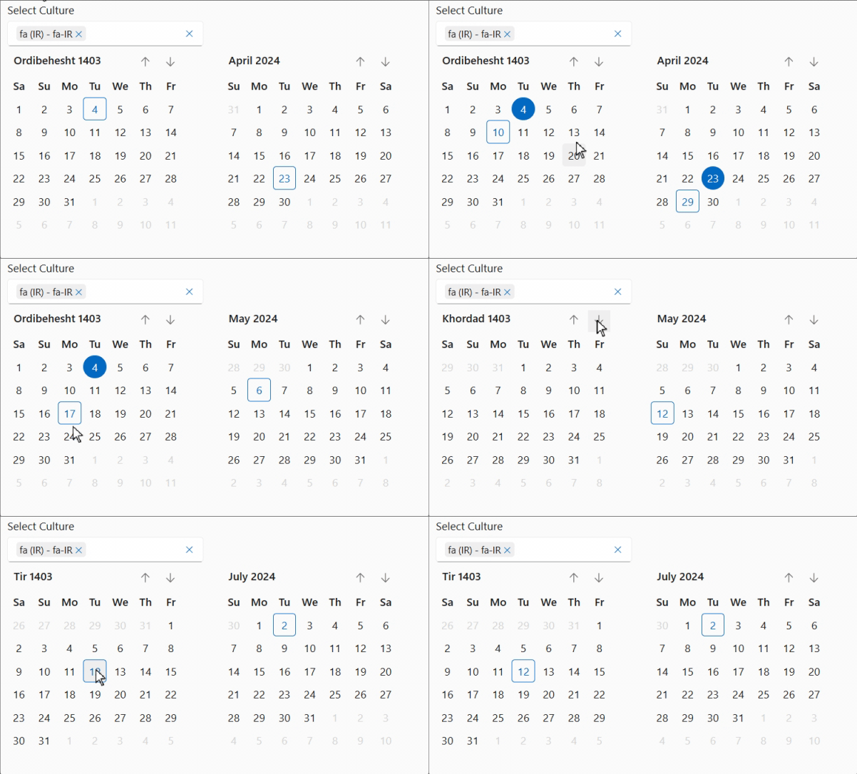
Correction of the way months and days are calculated, to better respond to certain “Cultures” (e.g. fa-IR).
<FluentCalendar Culture="@(new CultureInfo("fa-IR"))"></FluentCalendar>
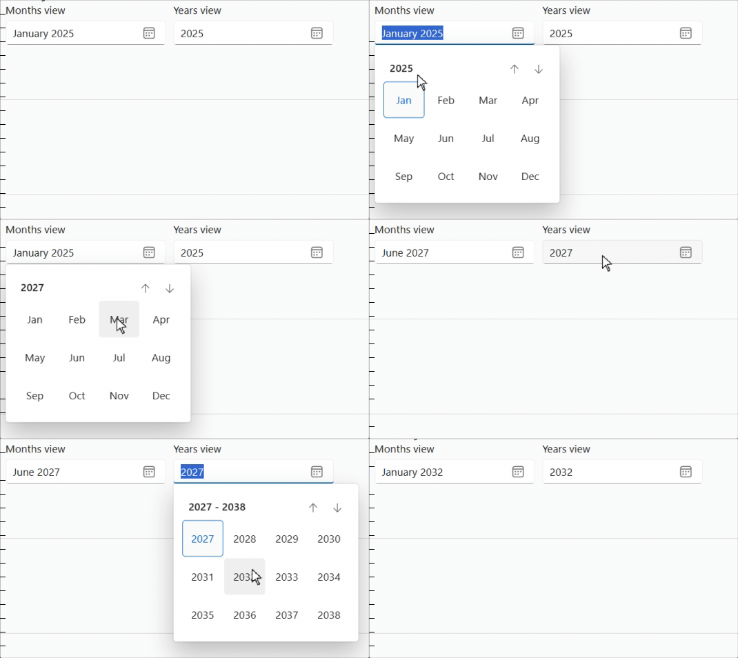
Add a View attribute to FluentDatePicker components to allow month or year selection only.
<FluentDatePicker View="CalendarViews.Months" />
<FluentDatePicker View="CalendarViews.Years" />
Grid
We’ve added a new AdaptiveRendering property to the FluentGrid component.
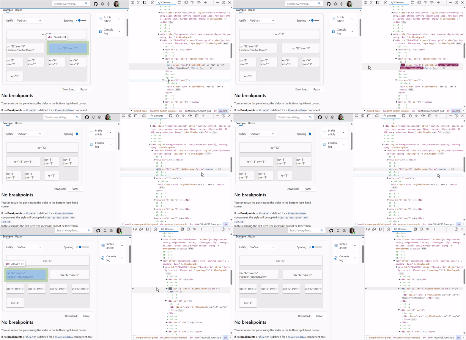
AdaptiveRendering allows you to not generate the HTML code of the FluentGridItem that respects HiddenWhen.
In other words, when AdaptiveRendering=false (default), the contents of the FluentGridItem are simply hidden by CSS styles,
whereas if AdaptiveRendering=true, the content of the FluentGridItem is not rendered by Blazor.
In some cases where this content is large, it may be more efficient not to generate the HTML code rather than simply hide it.
<FluentGrid AdaptiveRendering="true">
   ...
</FluentGrid>
Wizard
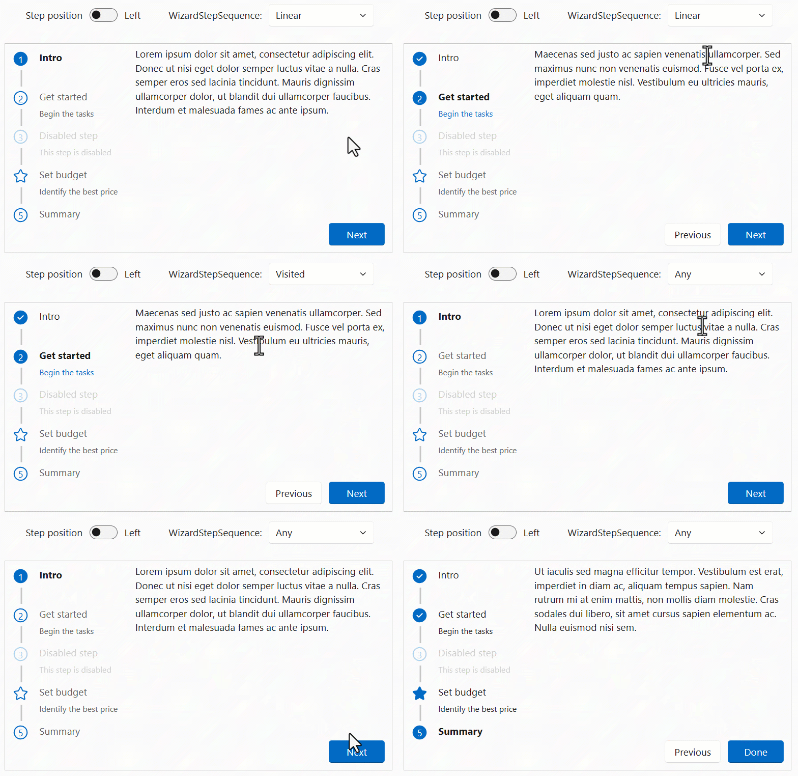
Add a new StepSequence attribute to allow direct access to previous steps or to all FluentWizard steps.
- Linear : The user can only access the next/previous step using the Next/Previous buttons.
- Any: The user can access all steps by clicking on an item.
- Visited: The user can move on to the next step using the Next button, or go to any previous step already visited.
Of course, only non-deactivated steps are accessible.
For compatibility reasons, the default mode is
Linear.
DataGrid
Clear sort
Previously, when a sort was applied on a data grid (by clicking on a column header button), there was no option to remove the sort.
It is now possible to right-click on the column header to delete the sort and restore the default situation.
For accessibility reasons, you can use Ctrl + Enter to remove the sort when the column header is in focus.
Column Width
It is now possible to define column widths using a new Width attribute when defining columns.
This replaces the GridTemplateColumns property, which is still usable, but you can’t use both to define column widths:
either via GridTemplateColumns or via Width, but not both.
Example
<FluentDataGrid Items="@people">
    <PropertyColumn Width="100px" Property="@(p => p.PersonId)" />
    <PropertyColumn Width="50%"   Property="@(p => p.Name)" />
    <PropertyColumn Width="50%"   Property="@(p => p.BirthDate)" />
</FluentDataGrid>
SortBy
Previously, the PropertyColumn did not support the SortBy parameter.
It is now possible to provide a default sorting configuration, adding the ability to define a custom implementation of SortBy.
More details on #1877
MenuButton
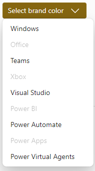
We’ve added a ChildContent parameter to FluentMenuButton.
This makes it possible to manually supply FluentMenuItem children and thus use all its parameters (such as Disabled).
Popover
We’ve added a FixedPlacement attribute to the FluentPopover component to resolve certain positioning problems.
This value indicates whether the region is positioned using CSS position: fixed. Otherwise, the region uses position : absolute.
Fixed positioning allows the region to be independent of parent containers.
PullToRefresh Request
To avoid starting to display the “Tip” of the PullToRefresh component, new parameter DragThreshold hides the “Tip” until it has been pulled to at least DragThreshold pixels.
Accessibility
- AppBar: Apply “role” requirements #1871.
- DataGrid: Add column width resizing, using keyboard:
+or-to enlarge or shrink column,Shift+Rto return to original size.
Bugs
- Input NotifyFieldChanged is called twice for all
FluentInputBasederived components #1846 - Paginator spelling issue in
FluentPaginator.razor.cs#1829 - Select Allow value to be set when component is disabled #1892
- Slider Fixes thumb redraw issues #1873
- Wizard Fix the Wizard bullet number style #1905
Icons
We’ve also updated the icon library with 15 new illustrations.
Miscellaneous corrections
The rest of the fixes and changes for this release are (again) quite a long list. We refer you to the What’s new page on the documentation site for a complete overview (including links to issues and change requests on GitHub).
Web sites
- Documentation: https://www.fluentui-blazor.net
- Preview: https://preview.fluentui-blazor.net
- NuGet packages .NET8: https://aka.ms/blazor/fluentui/libs
Feedback
If you find something out of the ordinary, let us know in the repo on GitHub, or Twitter / X.

